When using adaptive unit layout functionality, the content of the units will be adjusted according to the users screen size. This functionality is available in units that are created on Custom engine only.
User can create a unit that will look good on desktop and by using the adaptive mode, the unit will be adjusted to the size of the screen without a need to create more than one layout for each device.
This feature release includes
-
The workflow must be to created for desktop and will be adapted to mobile!
-
Elements will be resized only if their original size is bigger than the mobile screen.
Resize logic
-
Element new width will be 100% without horizontal padding, If one of the following conditions exists:
-
Element width is equal to the original unit.
-
Element width is wider than the original unit.
-
-
Element new width will be 100% minus 20px padding on both left and right sides, If all the following conditions exist:
-
Element is wider than the mobile screen.
-
Element is narrower than the original unit.
-
Element does not go beyond the limits of interaction.
-
-
Element height will be resized If all the following conditions exist:
-
Element type is IMAGE or STICKER.
-
Element width was changed (adapted).
-
-
All elements will be horizontally centered.
-
Elements vertical position is being set from top to bottom.
-
All slide's heights will be set according to the highest slide.
Elements supported
-
Image
-
Text
-
Poll/Interactive poll
-
Stickers
-
Shapes
-
Buttons
-
Video as background
-
Interactions
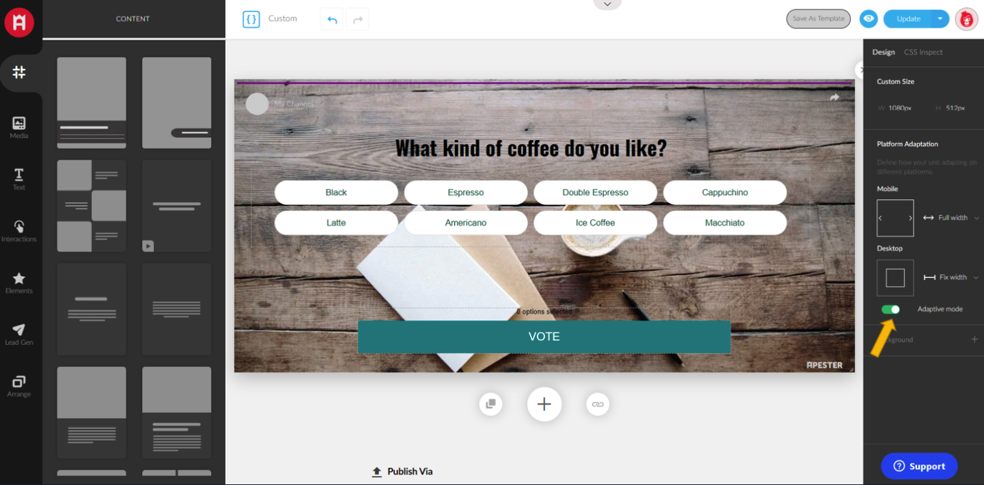
The adaptive mode can be found on the Design panel of the custom engine in the section “Platform Adaptation”
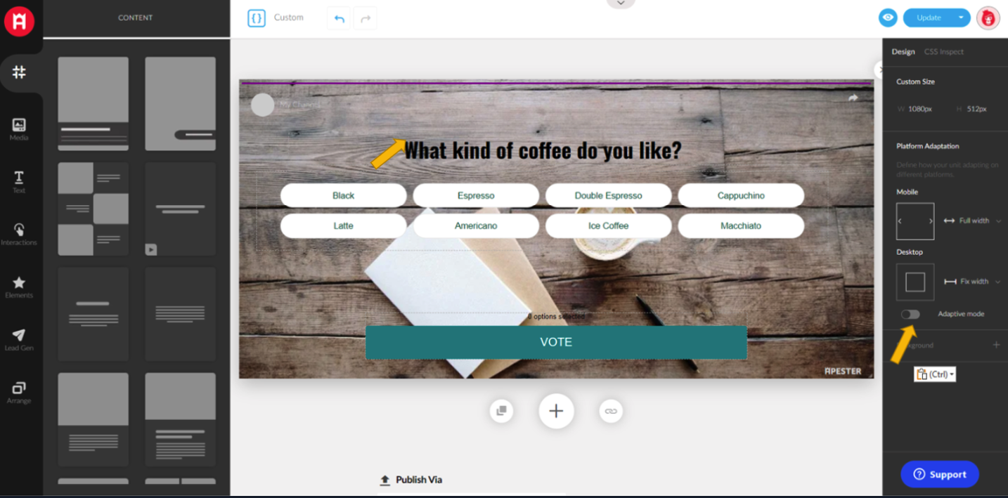
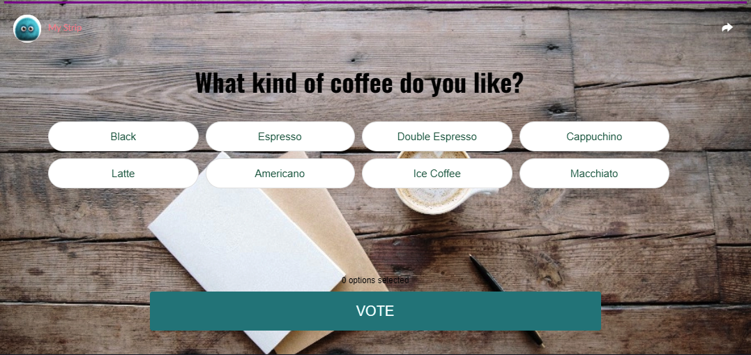
Desktop:
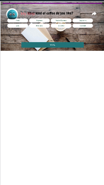
Mobile Preview:
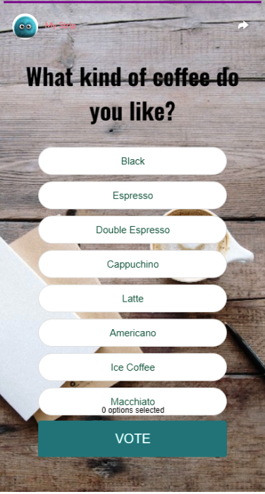
After enabling the adaptive mode:
Mobile preview:

Comments
0 comments
Article is closed for comments.